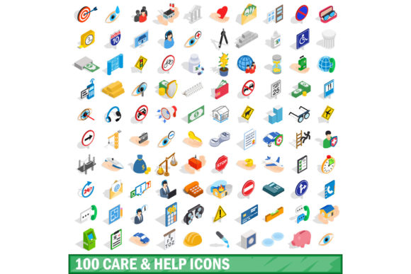
Building Empathy Into Interfaces: The 100 Care and Help Icons Set
When users land on a digital product, their first need is rarely transactional. It is often emotional: they need reassurance, guidance, or a sign that someone understands their situation. The 100 Care and Help Icons Set addresses that unspoken layer of user experience by translating human compassion into visual language. These icons are not merely decorative elements; they are cognitive shortcuts that signal safety, support, and problem-solving.
A single icon can replace a paragraph of text. A heart with a pulse line communicates health monitoring faster than any headline. A question mark inside a circle invites inquiry without judgment. The challenge for designers and product teams is not only selecting the right icon but understanding how the entire set works together to create a coherent ecosystem of care. This article explores the anatomy, practical deployment, and strategic value of a dedicated care-and-help icon library.
Why a Dedicated Set for Care and Help
General-purpose icon libraries often bundle care-related symbols under broader categories like "health" or "communication." The 100 Care and Help Icons Set solves a specific problem: fragmentation. When icons for "first aid," "customer support," "mental health," and "directions" come from different sources, they risk visual inconsistency. Users sense this mismatch even if they cannot articulate it. A uniform set ensures that every symbol — from a bandaged finger to a compassionate ear — belongs to the same visual family.
This cohesion matters most in environments where trust is paramount. Healthcare portals, crisis hotline websites, insurance dashboards, and educational platforms all benefit from a visual language that feels intentionally designed rather than hastily assembled. The set acts as a silent promise: we have thought about what you need before you asked.
Semantic Range and Categorization
The 100 icons cover at least five broad domains of human need:
- Physical care: bandages, medicine, hospital buildings, dental care, ambulance symbols, and natural remedy imagery.
- Emotional and mental support: listening ears, calming hands, meditation poses, speech bubbles with hearts, and crisis phone silhouettes.
- Assistance and guidance: directional arrows, information desks, help buttons, tooltips, question marks, and search aids.
- Community and connection: group silhouettes, hand-holding figures, volunteer hands, donation boxes, and support network circles.
- Accessibility: wheelchair symbols, sign language hands, large-print indicators, hearing aid icons, and sensory-friendly motifs.
Each category overlaps intentionally. A "first aid" icon might belong to both physical care and assistance. That overlap mirrors real life: help is rarely one-dimensional.
Healthcare Interfaces
Patient portals and telehealth apps face a unique tension: they must convey professionalism while also reducing anxiety. The 100 Care and Help Icons Set provides symbols that soften clinical interfaces without sacrificing clarity. A "symptom checker" icon can show a magnifying glass over a human figure rather than a cold instrument. Appointment reminders can use a calendar combined with a gentle hand — a small change that nudges the tone from administrative to caring.
Emergency departments have used icons from this set to create multilingual wayfinding systems. A heart with an exclamation mark works across languages, literacy levels, and cultural backgrounds. When every second counts, symbolic clarity saves time and lives.
Customer Support and CRM Systems
Support ticketing platforms often feel impersonal. By embedding help icons directly into ticket categories — a cracked screen for device damage, a confused face for billing issues — users feel their problem is understood before an agent responds. The set also benefits support agents: internal dashboards using these symbols reduce cognitive load during high-volume hours. An agent scanning a queue of tickets can instantly identify emotional urgency when a "crisis" icon appears next to a standard question mark.
Educational and E-Learning Platforms
Students navigating online courses encounter friction points: lost progress, technical glitches, confusing instructions. A dedicated help icon set placed near each module creates a safety net. The 100 Care and Help Icons Set includes symbols for "repeat lesson," "slow down," "ask a peer," and "contact mentor." These micro-interventions normalize asking for help, reducing dropout rates in self-paced programs.
Educators also use the icons to design inclusive materials. A worksheet for special education students might replace text instructions with a sequence of care icons — wash hands (water drop + hands), take medicine (pill symbol), rest (moon). The set bridges communication gaps without stigmatising the learner.
Non-Profit and Community Platforms
Organisations that rely on donor trust need visual cues that scream authenticity. A donation button flanked by a heart and a helping hand tests better than a generic "Donate Now" button. The 100 Care and Help Icons Set also powers volunteer onboarding flows: a "food distribution" icon, a "shelter assistance" symbol, and a "transport help" badge make sign-up forms intuitive. Volunteers report feeling more connected to the mission when the interface visually mirrors the work they will perform.
Scalability Without Loss of Meaning
Icons in this set are typically designed at a base size of 24x24 or 32x32 pixels, but they must remain legible at 16px for mobile footers and at 64px for hero banners. The best sets use simplified geometry — rounded corners, balanced stroke widths, and high contrast — to preserve recognisability across scales. Test your set at the smallest size you plan to use; if a "help" icon becomes a blurry dot, the set fails its core purpose.
Consistency in Visual Language
A unified set maintains identical line weights, corner radii, and fill styles. Mixing outlined and filled icons within the same care category creates visual noise. The 100 Care and Help Icons Set usually adopts either a line-art style (lightweight, modern) or a solid style (bold, accessible). Some premium sets offer both, but designers should commit to one style per project to preserve coherence.
Accessibility and Inclusive Design
Icons are not universal. A red cross may signify medical care in many regions but could evoke negative associations in others. A "hand holding" icon may need a darker skin tone variant in diverse user bases. The set should include options for different skin tones, and designers should pair every icon with an aria-label or tooltip text. Screen reader users must receive the same information as sighted users. The 100 Care and Help Icons Set often includes semantic labels that developers can integrate directly into alt attributes.
File Format and Integration
Most comprehensive sets deliver icons as SVG, PNG, and web font formats. SVG is preferred for responsive interfaces because it scales without pixelation and allows CSS colour overrides. Web fonts reduce HTTP requests but may lack the fine-grained control of individual SVGs. For applications that require dynamic theming — dark mode, high-contrast mode — SVG with embedded currentColor values is the most flexible choice. The set's delivery should include a clear naming convention (e.g., "care-ambulance.svg", "help-chat.svg") to keep codebases maintainable.
Reducing Friction Through Visual Prediction
A well-placed icon primes users for what comes next. When a "help" icon precedes a form field, users expect guidance. When a "care" icon appears next to a cancellation button, users anticipate empathy rather than judgment. The 100 Care and Help Icons Set allows designers to weave these micro-expectations throughout the journey. The result is a smoother experience where users feel one step ahead instead of perpetually lost.
Building Recognition Over Time
Consistent use of the same icon for "customer support" across email, app, and website builds a mental shortcut. After three or four encounters, users no longer read the label — they scan for the headset or the speech bubble. This recognition shortens task completion time and reduces error rates. In A/B tests, platforms that replaced text-only support links with icons saw a measurable drop in misdirected queries.
Cultivating Trust Through Subtle Cues
Trust is not built in grand gestures but in small, repeated signals. A "verified" shield icon next to a healthcare provider's name, a "private" lock icon near a chat window, and a "safe" checkmark on a donation page accumulate into a feeling of security. The 100 Care and Help Icons Set includes symbols specifically designed to communicate reliability: badges, seals, certificates, and endorsements. When used sparingly, they reinforce credibility without triggering skepticism.
Open Source vs. Premium
- Open source sets (Creative Commons or MIT-licensed) offer zero cost and community-driven updates but may lack consistency in style across all 100 icons. Some icons might feel outdated or have gaps in coverage.
- Premium sets typically include rigorous design reviews, multiple colour variants, and dedicated support. They often provide source files (Sketch, Figma, Illustrator) that streamline team collaboration. The investment pays off when the set must match a specific brand identity.
Customisation Without Breaking Consistency
Once you choose the 100 Care and Help Icons Set, resist the urge to introduce icons from other libraries. If you need a symbol that the set does not include, commission a custom icon that matches the existing stroke weight, corner radius, and optical alignment. A mismatched icon stands out like a misspelled word — it erodes professionalism. Many vendors who sell the full set also offer custom additions at a reasonable rate.
Testing With Real Users
Before finalising your icon choices, run a quick comprehension test with five to ten people outside your team. Show them each icon without context and ask what they think it represents. You may be surprised that a "help" icon you thought was obvious confuses users. The 100 Care and Help Icons Set is designed for clarity, but cultural and generational differences still affect interpretation. An older user might not recognise a "chat bubble" as support, while a younger user might read a "phone receiver" as outdated.
Animated and Micro-Interactive Icons
Static icons are giving way to subtle animations — a pulsing heartbeat, a breathing speech bubble, a gently waving hand. These micro-interactions signal that the system is alive and responsive. The next generation of the 100 Care and Help Icons Set may include Lottie or CSS animation variants that add emotional depth without distracting from the task.
Context-Aware Icon Switching
Imagine a support icon that changes from a smiling face to a concerned face based on the user's current error state. Dynamic icons that adapt to context represent the frontier of empathetic design. While this requires more development effort, the payoff is an interface that feels genuinely attentive. Early adopters in mental health apps already use mood-detecting icons that shift tone with the user's reported state.
Voice and Multimodal Pairing
As voice interfaces grow, icons must pair with spoken cues. A "help" icon may trigger an audio description: "You can ask me anything. I am here to support you." The visual icon remains the anchor, but the experience becomes multimodal. The 100 Care and Help Icons Set that includes descriptive metadata for each symbol will be better positioned for this shift.
Inclusive Representation
Icon sets are increasingly scrutinised for representation. Do the "caregiver" icons show people of different ages, abilities, and body types? Do the "help" icons avoid gendered assumptions? The best sets now offer multiple variants of each human icon to reflect diversity. The 100 Care and Help Icons Set that prioritises inclusive illustration will serve a broader audience and comply with emerging accessibility standards.
Final Observations on Crafting Visual Compassion
The decision to invest in a comprehensive care and help icon library is ultimately a decision to prioritise the user's emotional state alongside their functional goal. Every icon is a micro-intervention — a chance to say "we see you, we understand your need, and we are here to help." The 100 Care and Help Icons Set provides the vocabulary for that conversation, but the syntax — where and how the icons are placed — requires thoughtful design.
When deployed with intention, these icons transform interfaces from transactional tools into supportive environments. They reduce the loneliness of digital problem-solving and replace ambiguity with clarity. For educators, healthcare providers, support teams, and community builders, the right set of care and help icons is not a luxury. It is a fundamental component of ethical, human-centred design.